
This Adobe InDesign Portfolio Template Plays by One Rule: Black, White, and Unforgiving
Weandthecolor.com · View original source
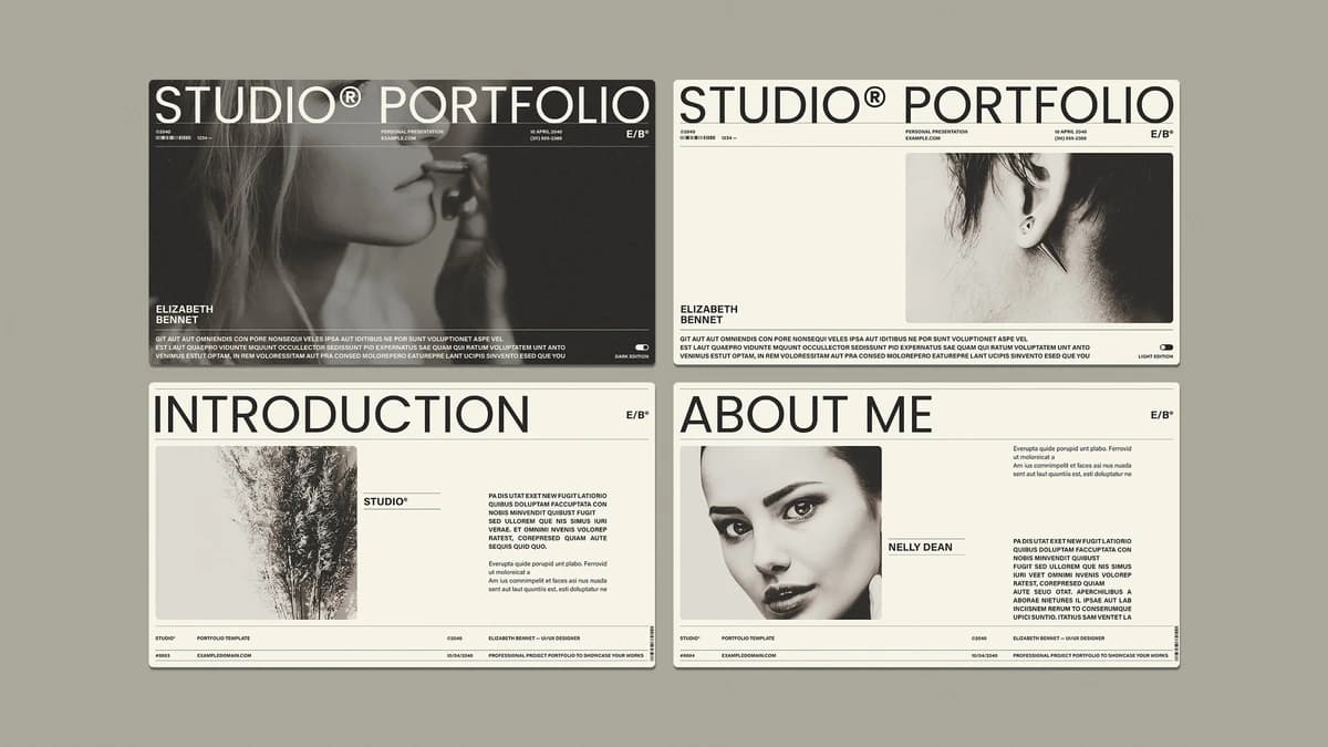
Adobe InDesign has long been a go-to tool for creatives looking to showcase their work, and a new portfolio presentation template has emerged that embodies a minimalist yet impactful design philosophy. This template, created by contributor RedGiant, is characterized by its strict adherence to a black-and-white color scheme and a twelve-page structure, making it an intriguing option for professionals in fields such as UI/UX design, photography, and architecture. The template is designed specifically for digital presentations, with dimensions of 1920 by 1080 pixels, ensuring that it is optimized for screen use rather than traditional print formats.
Upon downloading the template, users are greeted with a straightforward layout that prioritizes clarity over excessive embellishment. The twelve-page format is particularly noteworthy, as it enforces a discipline that many designers struggle with when creating their portfolios. This structure, which I have termed the Twelve-Page Discipline, encourages users to curate their work effectively, limiting them to three project spreads and one skills page. This constraint not only simplifies the design process but also compels users to select their strongest projects, thereby enhancing the overall quality of the portfolio.
The template's monochromatic design serves a dual purpose. Firstly, it eliminates visual distractions, allowing the viewer to focus on the composition of the showcased work rather than being influenced by color grading. This approach, which I refer to as Grayscale Confidence, exposes the quality of the imagery, ensuring that only the most compelling photographs stand out. However, it is essential to note that the photography used in the preview is not included in the downloaded file. Users must source or create their own grayscale images to maintain the template's intended aesthetic.
Functional Design Elements
One of the standout features of this template is its recurring footer band, which I have dubbed the Kicker Bar Wayfinding. This element provides essential information, such as the template title, a date field, and a page reference, on every spread. This consistent feature helps maintain orientation during presentations, allowing viewers to track their progress through the portfolio. By swapping the placeholders with personal details, users can create a customized experience that feels tailored to their specific pitch.
The template is particularly well-suited for creatives whose work is visually striking and can be effectively presented in black and white. The layout is designed to accommodate large images paired with succinct text blocks, making it ideal for UI/UX designers, photographers, and architects. However, for those whose work relies heavily on color or intricate typography, the template may present challenges. The monochrome default may require users to invest additional time in modifying the layout to suit their needs, which could detract from the overall efficiency of the design process.
Despite its strengths, there are some friction points to consider. The skills page is limited to four percentage-bar slots, which may necessitate manual adjustments for users wishing to include more skills. Similarly, the portfolio index page is designed for six featured projects, meaning that any deviation from this number will require careful margin adjustments. These limitations are not necessarily dealbreakers but do highlight the template's opinionated grid structure, which favors a clean and disciplined presentation over flexibility.
Why it matters
The emergence of this Adobe InDesign portfolio template reflects a growing trend among designers and creatives towards minimalism and functionality in their presentations. As the creative industry becomes increasingly competitive, the ability to present work in a clear and compelling manner is paramount. This template's focus on restraint and discipline encourages users to prioritize quality over quantity, ultimately leading to a more impactful portfolio.
For technologists and creators, the implications of such a template are significant. It underscores the importance of thoughtful design choices and the value of a structured approach to showcasing work. As more professionals seek to differentiate themselves in a crowded marketplace, tools that facilitate effective presentation will become essential. This template not only serves as a practical solution for portfolio creation but also embodies a philosophy that can inspire users to refine their work and presentation strategies.
In conclusion, this Adobe InDesign portfolio presentation template by RedGiant stands out for its disciplined approach to design. With its monochromatic palette, structured layout, and functional elements, it offers a compelling option for creatives looking to present their work effectively. While it may not be suitable for everyone, those who can leverage its strengths will find it to be a valuable asset in their professional toolkit.
Frequently asked questions
- Are the photos shown in the preview included with the template?
- No, the photos shown across the preview spreads are for display purposes only and are not included in the downloaded file. Users will need to supply their own grayscale imagery.
- What are the dimensions of the template?
- The template is built at 1920 by 1080 pixels, making it suited for screen presentations rather than standard print formats like A4.
- Is the template suitable for colorful portfolios?
- The layout and type hierarchy were built around a monochrome system, so adding color means rebuilding the visual balance yourself, which may not be ideal for colorful portfolios.
Related stories
AI & art news in your inbox, daily
The day's top stories, summarized. Free, no spam, unsubscribe anytime.