
The Making of Cursor's Icons – Minor Adventures
Minoradventures.co · View original source
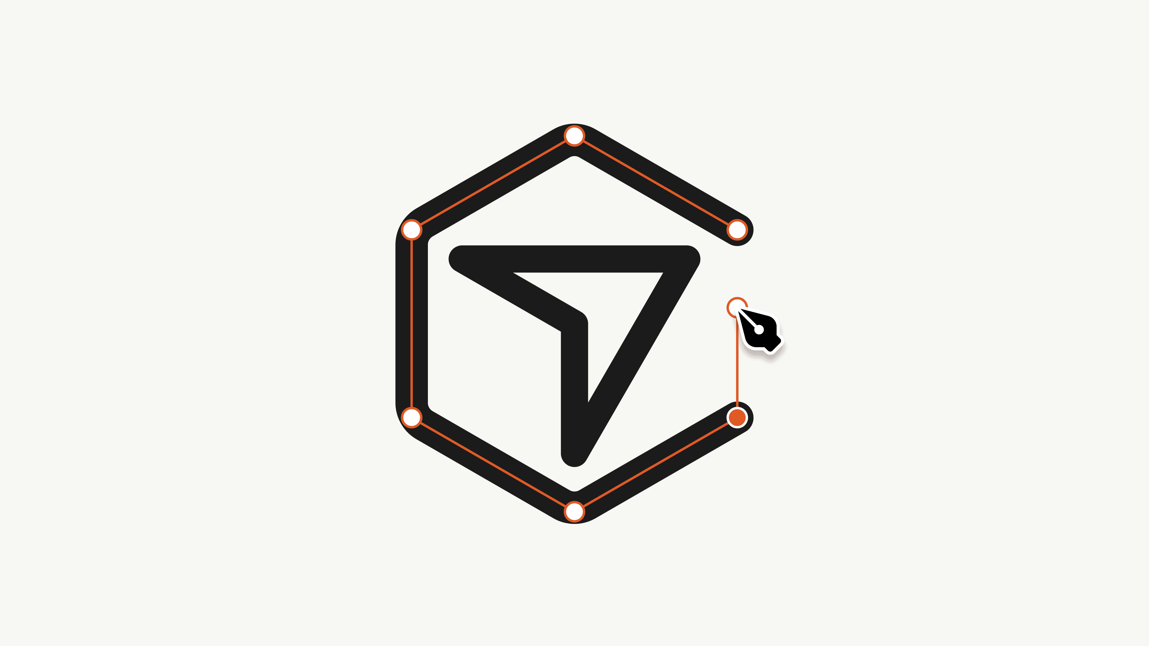
In a significant development for design within the tech industry, Cursor has unveiled a comprehensive new icon set, a project that has been in the making for approximately one year. Designed to align with the evolving identity of Cursor as it expands beyond its origins in the Visual Studio Code (VS Code) ecosystem, this new icon system encompasses over 600 icons, each meticulously crafted by hand. The initiative not only reflects the dedication to quality and detail but also serves as a valuable learning resource for aspiring designers seeking insights into the design process.
The Evolution of Cursor's Iconography
The journey to create this new icon set began with the realization that Cursor's inherited iconography was no longer adequate. Originally built upon the Codicons, an open-source icon set used by VS Code, the icons had become inconsistent and outdated. The inherited set included 468 icons, although documentation suggested there were 498, with some codepoints leading to nowhere. This inconsistency is not uncommon in inherited design systems, where a lack of ownership can lead to drift in quality and coherence.
As Cursor began to introduce new concepts that were not represented in existing icon libraries—such as AI agents, execution types, and various levels of computational effort—it became clear that a tailored vocabulary was necessary. This realization prompted the design team to embark on creating a cohesive icon set that would accurately represent the brand and its functionalities.
The new icons are available in two sizes—16px and 24px—each designed on its own grid. The choice of two sizes stems from the understanding that icons must maintain visual integrity across different scales. The 16px icons, drawn on a 16px grid with a 1.25px stroke, are optimized for clarity at smaller sizes, while the 24px icons feature a 1.5px stroke, allowing for greater detail. This approach mirrors the concept of optical sizes in typography, where different designs are created for text and display purposes.
Design Philosophy and Technical Considerations
A key aspect of the design process was the careful consideration of stroke weight. The 1.25px stroke was determined after extensive testing, as a 1px stroke appeared too thin, while a 1.5px stroke felt excessively heavy. This nuanced decision-making illustrates the meticulous attention to detail that characterizes the project. Additionally, the icons were designed to function as symbols rather than fixed-size images, which allows for flexibility in rendering across various display sizes.
The construction of the icons follows a systematic approach, prioritizing technical precision over organic forms. The design process began with straight lines, which were then rounded to create a friendly yet professional aesthetic. This method ensures that all icons feel unified, creating a sense of cohesion throughout the set. The visual style aims to be stripped down and utilitarian, avoiding decorative elements that could detract from legibility, especially at smaller sizes.
To maintain consistency, recurring elements such as folders and files were drawn uniformly across different icons. This attention to detail extends to the junctions where lines meet, where small notches are cut to prevent optical build-up, enhancing clarity even at reduced sizes. The design philosophy emphasizes the importance of maintaining natural proportions, ensuring that objects do not appear toy-like or artificially constrained within a square.
Why it matters
The introduction of Cursor's new icon set represents a significant advancement in the realm of design for coding tools. For creators and technologists, this project underscores the importance of a cohesive visual language that can effectively communicate complex concepts. The meticulous design process serves as a case study for aspiring designers, illustrating how thoughtful decisions regarding stroke weight, shape construction, and consistency can lead to a successful design outcome.
Moreover, the project highlights the necessity for tech products to develop their own unique iconography as they evolve. As tools like Cursor continue to expand their functionalities, having a dedicated set of icons that accurately represent these features becomes essential for user comprehension and engagement. The careful crafting of these icons not only enhances the user experience but also reinforces the brand identity of Cursor as it carves out its niche in the competitive landscape of coding tools.
In conclusion, Cursor's new icon set is more than just a collection of images; it is a carefully curated visual vocabulary that reflects the brand's evolution and commitment to quality. This project serves as an inspiration for designers and technologists alike, emphasizing the value of thoughtful design in creating effective and engaging user experiences.
Frequently asked questions
- What is the significance of Cursor's new icon set?
- Cursor's new icon set represents a tailored visual vocabulary that aligns with its evolving brand identity, enhancing user experience and comprehension.
- How many icons are included in the new set?
- The new icon set includes over 600 hand-drawn icons, designed to cover various concepts relevant to Cursor's functionalities.
- What design principles were followed in creating the icons?
- The design principles focused on technical precision, natural proportions, and consistency across recurring elements, ensuring a cohesive and professional appearance.
Related stories
AI & art news in your inbox, daily
The day's top stories, summarized. Free, no spam, unsubscribe anytime.