
How to choose a UI font (and 10 Inter alternatives)
Yeptype.com · View original source
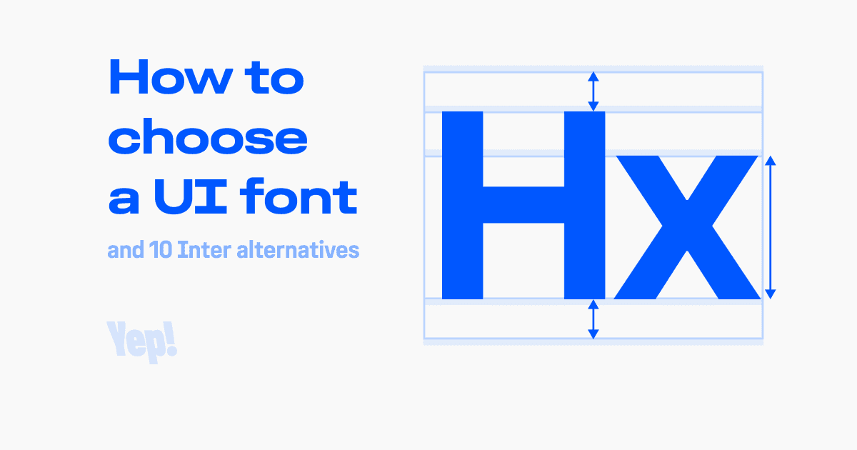
In the world of product design, the choice of font is a critical decision that can significantly influence user experience. While many designers gravitate towards Inter, a widely acclaimed UI font, it is not uncommon for stakeholders to request alternatives due to its ubiquitous presence. This article delves into the essential criteria for selecting a UI font that not only enhances aesthetics but also optimizes functionality, drawing on insights from a seasoned product designer with over a decade of experience in typography.
Key Criteria for Font Selection
When tasked with selecting a UI font, two primary criteria emerge as vital: cap-centered vertical metrics and a tall x-height. These characteristics ensure that text appears visually balanced and is easy to read on various interfaces. The first criterion, cap-centered vertical metrics, refers to the alignment of the font's bounding box. Specifically, it ensures that the space above the cap height is equal to the space below the baseline. This symmetry is crucial for achieving optical centering of labels within buttons and other UI controls, which in turn affects user interaction and readability.
To assess whether a font possesses cap-centered vertical metrics, designers can conduct a simple test. By typing a word—such as the fictitious term "Hanglovers"—and setting the font size to 1000 pixels, one can observe the alignment of the text box edges. If the top edge aligns with the top of the capital letter 'H' and the bottom edge meets the baseline simultaneously, the font meets this essential criterion. If not, it may be suitable for print but not for screen applications.
The second criterion, a tall x-height, is equally important. The x-height represents the height of lowercase letters without ascenders or descenders. A tall x-height—ideally around 75% of the cap height—ensures that the text appears as a cohesive block, enhancing readability and visual balance. Fonts like Inter, San Francisco, and Innovator Grotesk exemplify this standard, making them suitable choices for user interfaces.
The Importance of Cap-Centered Metrics and Tall X-Height
The significance of cap-centered metrics and a tall x-height cannot be overstated. When a label is centered by its cap height, it treats the text as a solid block, which can lead to misalignment if the lowercase letters do not visually connect with the capital letter. A tall x-height helps bridge this gap, allowing the lowercase letters to rise closer to the cap height, creating a more uniform appearance. This visual harmony is particularly crucial in UI design, where clarity and quick comprehension are paramount.
Furthermore, when icons accompany text labels, the eye tends to compare the icon with the first letter of the text rather than the entire word. This comparison reinforces the need for a tall x-height, as it ensures that the first letter aligns well with the icon, enhancing the overall visual coherence of the interface.
While advancements in CSS properties, such as text-box-trim and text-box-edge, promise to address some of the challenges associated with font metrics, their current level of support across browsers remains limited. As of mid-2026, these properties are not universally adopted, with only about 79% global usage reported. Therefore, designers are advised to prioritize fonts that already exhibit cap-centered metrics to ensure consistent performance across different platforms.
Recommended Alternatives to Inter
For designers seeking alternatives to Inter, several fonts meet the criteria of cap-centered vertical metrics and a tall x-height. Innovator Grotesk and Universal Sans both maintain a 75% x-height, making them excellent substitutes. Other options, such as Plain and SwissNow, come close at 73%. Each of these fonts has been carefully selected to ensure they provide the same level of visual balance and readability as Inter, making them suitable for a variety of user interface applications.
In conclusion, the choice of UI font is not merely a matter of aesthetics; it directly impacts user experience and interaction. By focusing on cap-centered vertical metrics and a tall x-height, designers can select fonts that not only look good but also function effectively in digital environments. As the landscape of typography continues to evolve, understanding these foundational principles will remain essential for creating intuitive and engaging user interfaces.
Frequently asked questions
- What are cap-centered vertical metrics?
- Cap-centered vertical metrics ensure that the space above the cap height of a font is equal to the space below the baseline, allowing for proper optical centering of text.
- Why is a tall x-height important in UI fonts?
- A tall x-height enhances readability by making lowercase letters visually closer to the capital letters, creating a more cohesive appearance in text.
- What are some alternatives to the Inter font?
- Alternatives to Inter include Innovator Grotesk and Universal Sans, both of which maintain a tall x-height and cap-centered vertical metrics, making them suitable for UI design.
Related stories
AI & art news in your inbox, daily
The day's top stories, summarized. Free, no spam, unsubscribe anytime.